

Shopify Website Optimization Guide-Product Card Optimization
Because in the process of attracting traffic, in addition to the product details page, the landing page plays an important role in the traffic entrance, so it is particularly critical too. Elements such as product list matching, layout, option color matching, and pictures largely reflect the professionalism of the website. The more professional your website appears, the more likely it is to gain customer trust and achieve conversions.
The product tag displayed on the product list page in Shopify contains the product’s title, price, picture, description and other information. These cards are usually displayed in the product display area of the listing page. Additionally, these cards can be added to other pages to showcase product information. Product cards can be divided into product tags, product images, titles, prices, and additional information (variation options/ratings). Combinations of these elements can be optimized.
Let’s start with the composition of the product card. The overall collocation must be harmonious and unified, the necessary elements must be complete and the primary and secondary elements can be distinguished.
Now let’s see some examples first, and you’ll probably know how.
Case 1
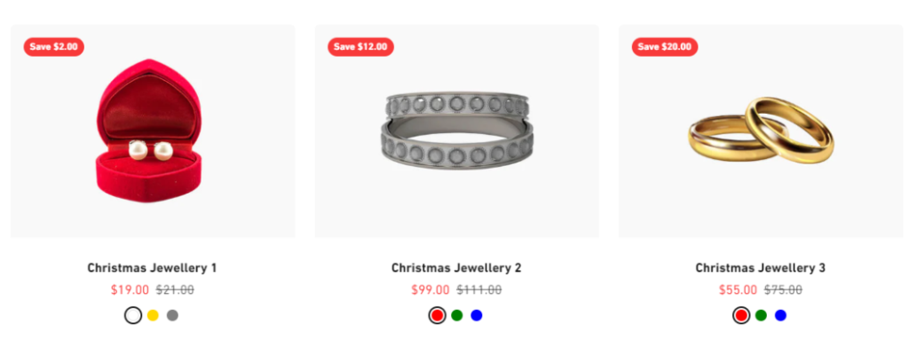
Advantages: This product card has the required elements and is relatively complete.
Disadvantages:
· The visual style lacks unity and appears messy. The same row of products displays three product images with extremely different main image colors, which affects the user’s visual experience. In addition, if products of different categories are arranged together, it will make people feel inconsistent, so consider displaying them in different categories.
· The product title is too casual and fails to reflect the actual value of the product. In a previous article we mentioned that the value of the product should be accurately reflected in the title.
· The price comparison is not obvious and the special price advantage cannot be demonstrated. Even though all items have a Save tag, it looks a bit fake.
If you can answer the above questions, congratulations, it means that you have a certain understanding of how to optimize product cards and have certain ideas. Next, we will analyze and dismantle the product cards that the we think are relatively complete, and share them with you.
Case 2
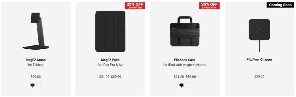
Advantages:
· The style is unified, unobtrusive and highly professional.
· The title is exquisitely designed, with bold fonts highlighting the product type, and non-bold fonts highlighting applicable devices, making the priority clear.
· Product labels are clearly differentiated.
Disadvantages: There is a lot of white space and it looks empty; the price distinction is not obvious.
Case 3
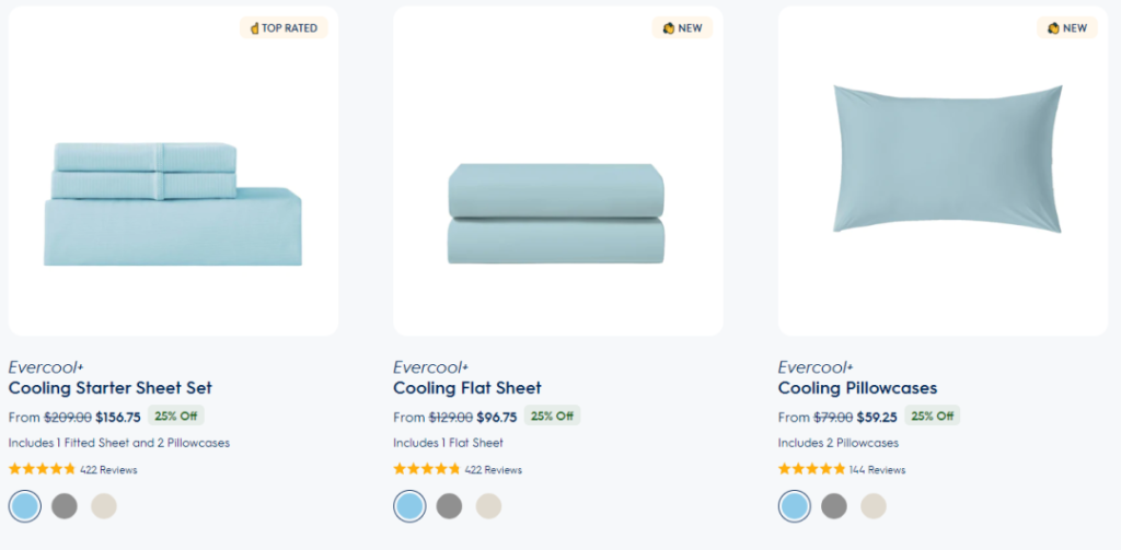
Advantages:
· The style is unified, unobtrusive and professional.
· The title has a little design to match the brand logo.
· Product image tags are unique and highly interactive.
· The product prices are prioritized, and there is an OFF label that is not obtrusive.
· Have product reviews (social credentials).
Disadvantages: We assume that the shortcoming is that the product title is too concise and does not fully demonstrate the value of the product.
Okay, the above is all about product card optimization. If you have better ideas, you are welcome to leave a message for communication. Dear operators/webmasters, it is recommended to refer to these points to check whether there is room for improvement in your website. The next tip will be more exciting, so stay tuned.
·END·
our address
A2903, Yake Center, Puyan Street, Binjiang District, Hangzhou, China
our PHONE
+86-15709611832